Nimble. Wrap Ups | One Nashville
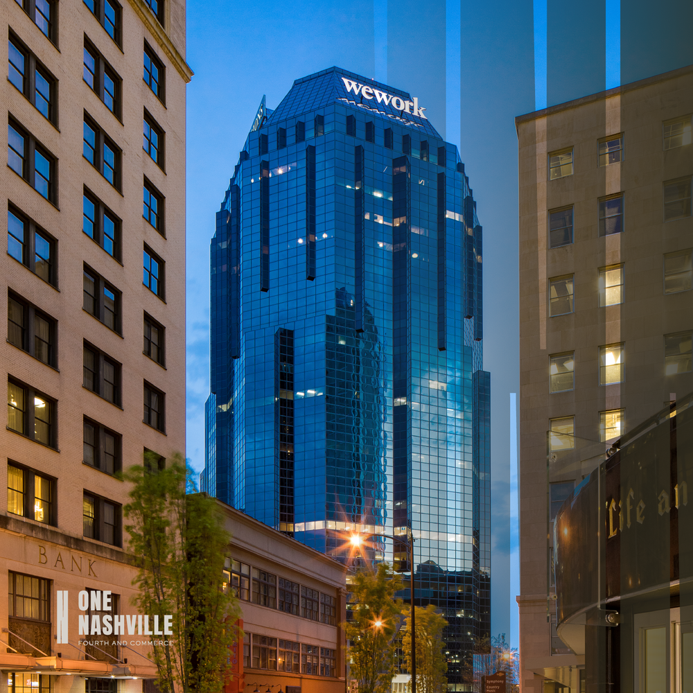
One Nashville is a 26 story, Class A office tower perched at the start of Printer’s Alley between Music City’s business district and SoBro neighborhood. A part of the city’s iconic skyline since 1986, Seattle-based Unico Properties identified the asset as the perfect place to anchor their Southeastern debut.
Acquiring the property in 2018 with a fearless spirit and simple strategy — to make the building a place people want to be — Unico approached our team to lead brand development, holding true to what’s been cool (and will continue to be cool) about Nashville with Pacific Northwest-inspired amenities.
Digging In
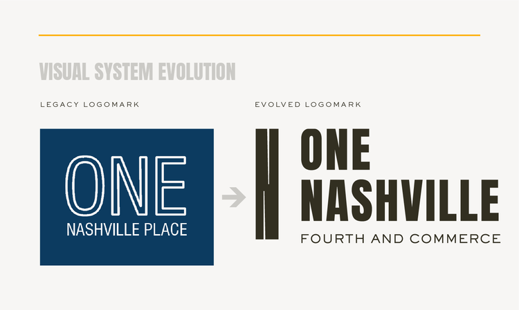
We kicked off the project with discovery research, interviews and a small naming evolution. Because ‘One Nashville Place’ was already well-recognized in the market with strong equity, we dropped ‘Place’ and added the location anchor, ‘Fourth + Commerce’ to better own the corner of two very prominent streets. Next, our team took a deep dive into brand development.
Positioning and Tone
Crafting a story to shape the asset’s reputation, we helped Unico define and express One Nashville’s unique qualities, promise and personality. Wholly focused on establishing an immersive user experience — from the addition of game-changing amenities to a laser focus on hospitality — we built a brand that would serve as a hub for exchange among tenants and the downtown community as a whole, with a radically friendly personality.
“Working with Unico and the Cushman teams has been a dream. Vision-driven and process-advocates, collectively we worked through precedent discovery, repositioning and visioning, and a stand-out launch-to-market plan worthy of [Unico’s] first splash into the Nashville market.”
Messaging and Positioning Snippets
Defining a Dramatic Visual System
Inspired by the history surrounding One Nashville and its connection to Printer’s Alley, we created a strong, elongated mark to represent the height of the building and the bold headlines of Nashville’s past. True to itself, with a refreshed modern look and a consistently friendly spirit, the new identity system was designed to tell a story in a dramatic and captivating way.
Its pattern work can be scaled successfully and used as a stand-alone feature or subtle accent to playfully integrate with copy and visuals surrounding it.
Its memorable color palette –a dark chocolate, paired with a signature golden yellow and complimenting warm gray light neutral, work together to build emotion and confidence in every application.


Launch to Market
When it came time to extend the visual brand into marketing applications, we designed a bold landing page, custom digital and high-end tangible tour collateral and a series of targeted e-blasts — key components to an effective launch-to-market campaign.
Scope Included:
Brand positioning and campaign messaging
Visual identity development
Digital tour collateral
Printed tour collateral
Announcement campaign strategy and design
Landing page design
E-blast series
Elements of the Launch-to-Market Campaign
“Nimble. understands that real estate professionals are a different breed—from how we think to how we make decisions. Their process is easy to follow and drives progress, with enough flexibility to allow our team to be ourselves. Having their Discovery Phase on the front end of the project helped drive direction—from understanding color, positioning and experiences that already existed in the market to developing the unique strategy and why behind our own brand. It was very important that Unico’s first asset in Nashville left a mark and Nimble. made a masterpiece out of few visits, interviews and actual facetime (since most of our team is Seattle-based). Great brands aren’t just pulled together overnight—it’s a process and Nimble. made it effortless for Unico.”


