Nimble. Wrap Ups | Windward Fairways
Context
Windward Fairways is a two-building Class-A office campus located off Windward Parkway in Alpharetta. Acquired in late 2019 with plans for selective capital improvements, NORO invited Nimble. to lead an overall brand refresh for the project inclusive of visual identity development, interiors consulting, and signage design and consulting. With a little paint and a whole lot of vision, we’re proud to share its lively transformation.
Photography: APG Photography
Building Brand
Beginning with brand development, we established a brand look and feel to unite the two Windward Fairways buildings under one identity system using respective addresses to distinguish. Suburban assets tend to present themselves in a series of hard-to-remember identifiers, ‘One’, ‘Two’ and an address numeric, so we simplified their respective IDs to re-enter with clarity (and improved wayfinding).
An abstracted monogram mark allowed us to visualize two-in-one [base form], taking color influence from the campus’ outdoor connection to its neighboring Big Creek Greenway and on-site greenspaces.
Approaching Interior Lobby and Common Corridor Refresh
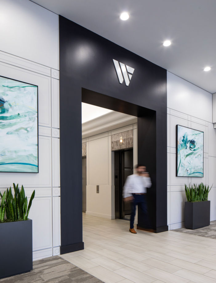
Collaborating with the NORO team to extend the refreshed brand into the physical environment, we led holistic process from conceptual design through punch, guiding solutions to remain modest with budget spend while maximizing impact.
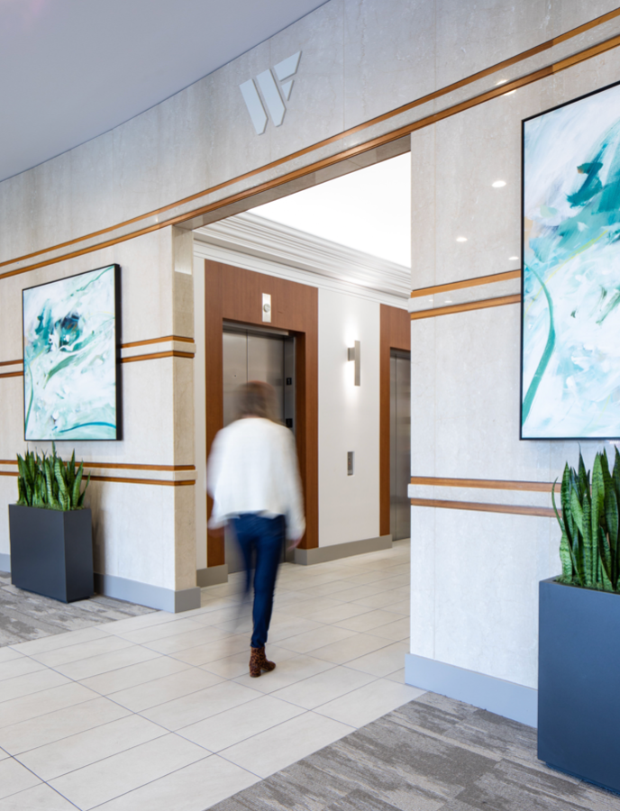
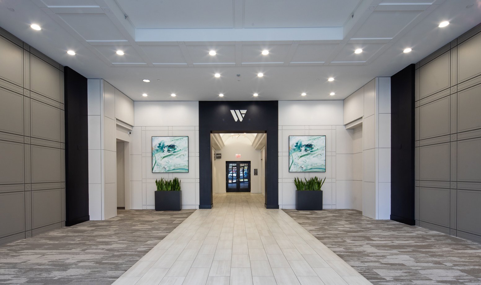
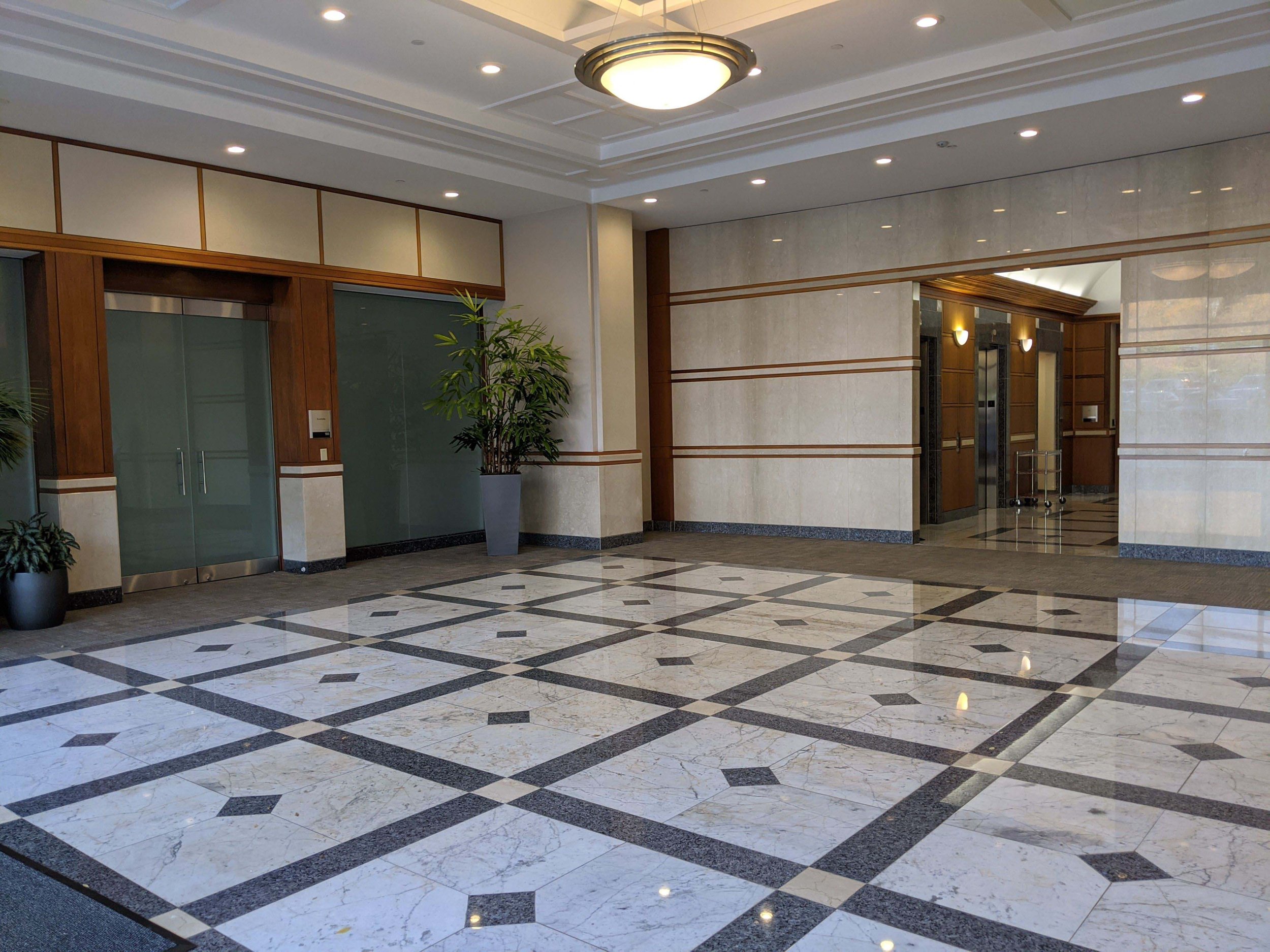
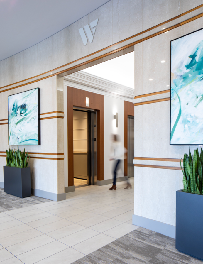
We approached interiors consulting with a lens on simplifying forms and introducing high contrast. Struggling from a strong case of the 90’s (and the ‘likeness’ of standard suburban development), we identified priority areas to redesign and elements to retain, ridding both lobbies of conflicting wood tones, multiple flooring types and overuse of geometry. We additionally worked to clarify lighting temperature and specs to unify experience from lobbies through building core.
Before + Afters
3025 Precedent Conditions
3025 Lobby Refresh
3025 Precedent Conditions
3025 Elevator Lobby Refresh
3025 Precedent Conditions
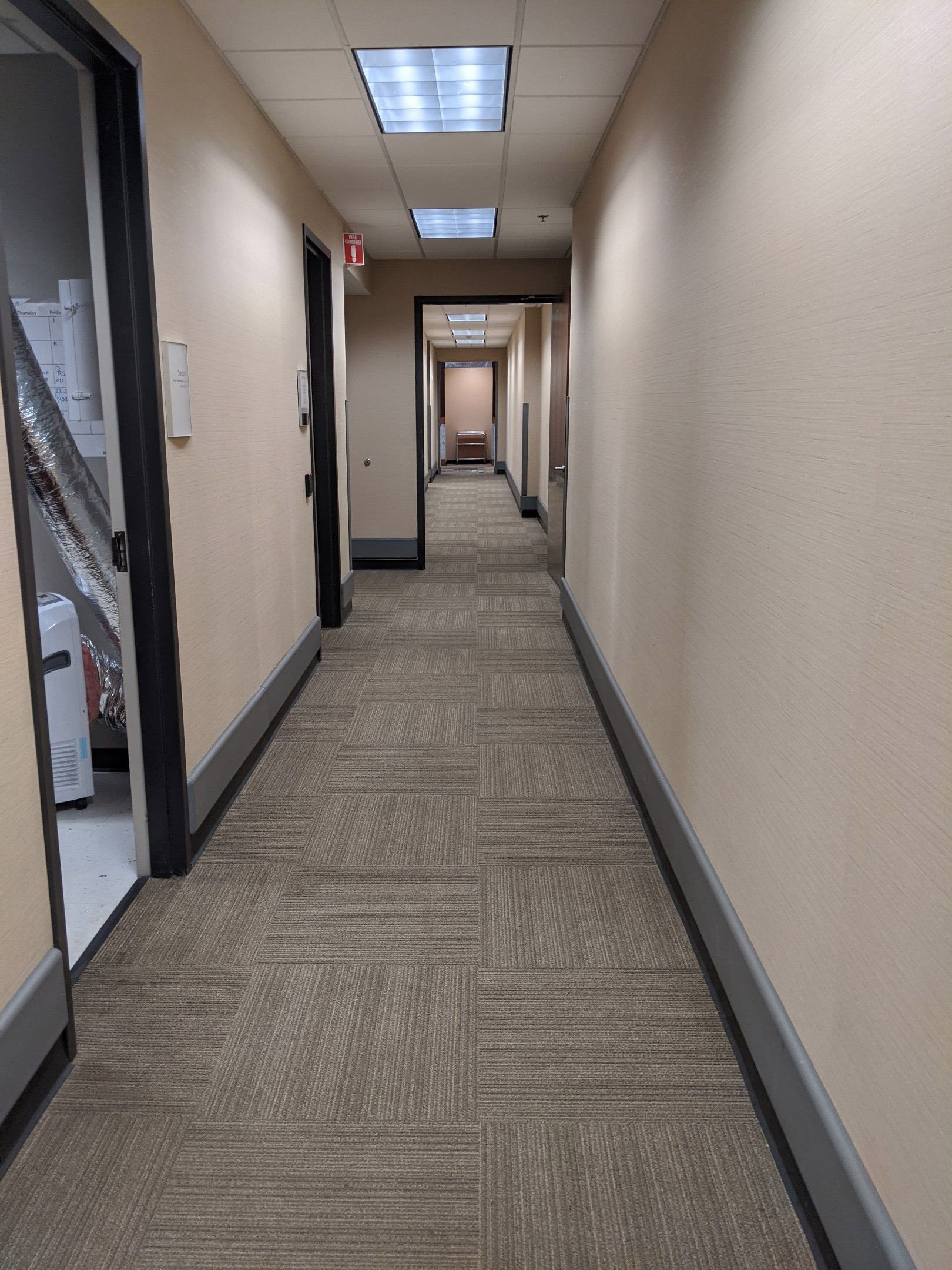
3025 Corridor Refresh
3015 Precedent Conditions
3015 Lobby Refresh
3015 Precedent Conditions
3015 Elevator Lobby Refresh
Approaching Signage Refresh
In joint effort to extend the new brand while keeping signage spend at a minimum, we approached signage as a refaceeffort, allowing color to serve as a pronounced wayfinding cue. Interior signage standards were also holistically revamped, evolving existing prefab hardware with on brand insert replacement featuring new icons and accessible braille.

